Interactive mapping websites should be intuitive so a user can easily get to grips with navigating around the mapping and using tools to interrogate the associated data. For instance:
- Visitors need to immediately understand the geographic context, and how to find the information they are looking for.
- Most people know how to use Google Maps and therefore expect to find similar looking tools and controls that they are familiar with.
- More complex tools, such as those allowing layers of geographic information to be toggled on and off, should be easily accessible and simple to understand limiting the need for instructions.
- Icons, such as those used to download, link or share information should also be instantly recognisable.
Here we look at five interactive mapping websites that have been designed to be intuitive to enable wider public consumption.
1. Stoke-on-Trent Bus Map
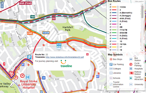
Stoke-on-Trent Bus Map is an interactive version of a printed bus map. The interactive version allows the user to navigate around the City of Stoke-on-Trent and display different bus routes by using a ‘layer panel’ on one side of the web browser. Clicking on a bus route gives links to timetables and journey planning information. The custom street mapping is clear whilst not detracting from the bus routes themselves.
2. Planvu
Planvu is an interactive web mapping solution, designed for use by Local Authorities to allow the public to view spatial planning strategies. As a legal document for public consumption, it’s essential that such sites are designed to be as easy to use and as accessible as possible. Planvu allows simple navigation and location search, as well as links from the policy areas on the map to specific planning policy information. Simple ‘tabs’ allow the user to choose between
- a search tool
- an overview map
- a key
- the policy information
3. EMODnet Human Activities
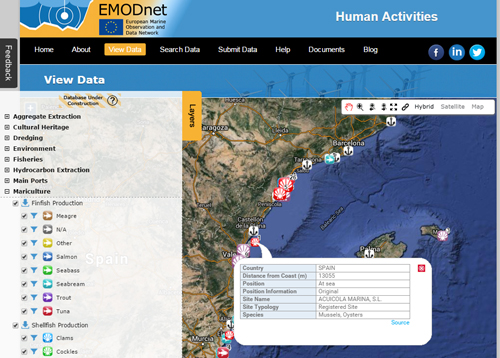
This site is designed for industry related to the maritime and marine activities as well as research and education sectors. Although its’ title might not be familiar outside the marine sector, the interactive mapping has been designed to appeal to a broad user-base and blends in with existing branding.
The site uses familiar navigation tools and the immediately recognisable selection of Google Map bases. A Legend panel, which pops open when the map is first open, offers the user the ability to display and interrogate data layers by themes defined by the European Commission. Much effort has been put into the design of the map symbols so they are easily recognised by those in the marine sector and beyond.
4. Zetica
The interactive mapping application for Zetica is an online mapping tool giving prospective developers the ability to browse and download site-specific maps on the relative level of risk provided by WWII bombing. The tool allows users to pan and zoom around the map and search by City, Town and Postcode, then complete a form and deliver a PDF map by email.
5. Galvanisers Association
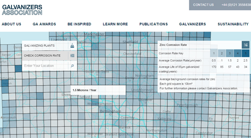
Any information that has a spatial element can be put into an interactive map. Assuming the interactivity has been carefully designed to be intuitive, it can be an effective method of communicating large amounts of data. The interactive map for the Galvanisers Association, blends into the corporate styling of its website. It shows specialist corrosion data to better inform its customers.


Comments are closed here.