 May 7th 2026
In today’s data-rich environment, organisations face a common challenge: how to turn raw, complex datasets into actionable insight. As GIS consultants, we often work with large spatial datasets that, on the surface, can feel overwhelming. However, with the right approach, these datasets can reveal patterns and trends that support smarter, evidence-based decisions.
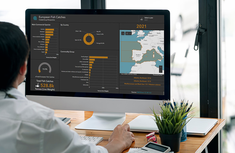
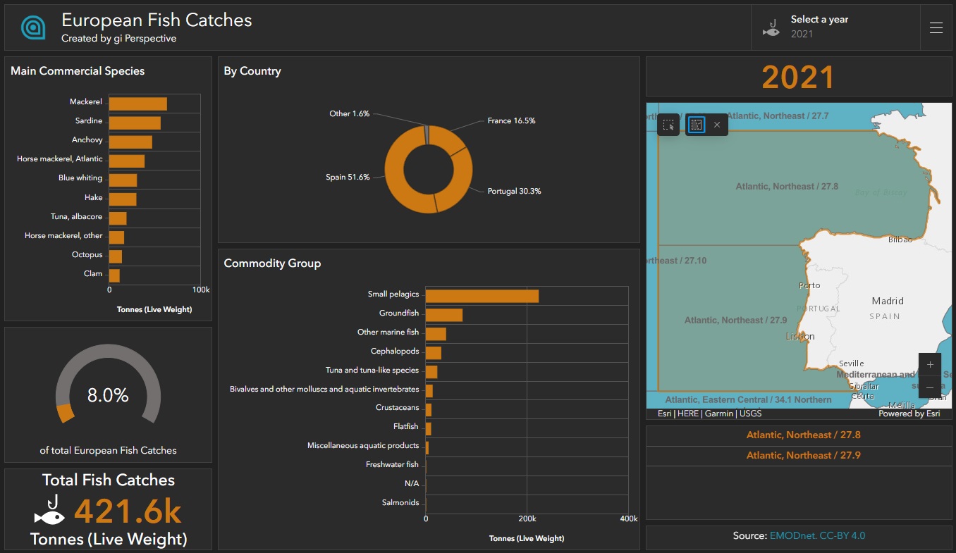
In this post, I walk through the process of creating an interactive Esri ArcGIS Dashboard using European fish catch data, demonstrating how thoughtful data preparation and design can transform complexity into clear, decision-ready visuals.
Cover Image: NAMPIX/stock.adobe.com
1. Data Discovery and Download
The first step is understanding what data is available and how it aligns with your objectives. In this case, the dataset included spatial, temporal, and categorical information on fish catches across Europe. It was sourced from EMODnet, a network of organisations supported by the EU’s Integrated Maritime Policy.
 mjstudio/stock.adobe.com
The data was available in Esri Geodatabase format and accompanied by detailed metadata, including lineage, technical specifications, and usage constraints. While comprehensive, the dataset still required careful exploration to identify the most relevant fields and confirm completeness.
At this stage, the key questions are:
- What data is actually needed?
- How reliable is it?
- What decisions should the dashboard support?
These considerations guide the entire workflow.
2. Preparing the Data
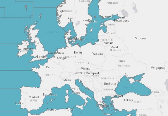
The dataset included hierarchical geographies based on FAO European Fishing Areas. Some categories were too broad, while others did not provide consistent coverage across Europe. To ensure consistency, the data was filtered to include only FAO Sub-Areas, the smallest geographic units that cover the full region.
To optimise performance, the join between the catch data and geographic boundaries was indexed. This step is essential when working with large datasets, as it ensures that dashboard interactions remain responsive.
Once prepared, the dataset was published to ArcGIS Online for use in the dashboard.
3. Creating the Map
A new map was created in ArcGIS Map Viewer and populated with the prepared data. The design focused on simplicity and clarity, avoiding unnecessary visual clutter.
A blue colour scheme was selected for the fishing areas, aligning with company branding and creating a consistent visual identity across the dashboard. The map serves as the central element, anchoring all other components.
 ESRI | HERE | Garmin | USGS
4. Adding Elements and Linking the Data
An ArcGIS Dashboard was then created, using a dark theme to provide strong visual contrast and a modern, professional appearance.
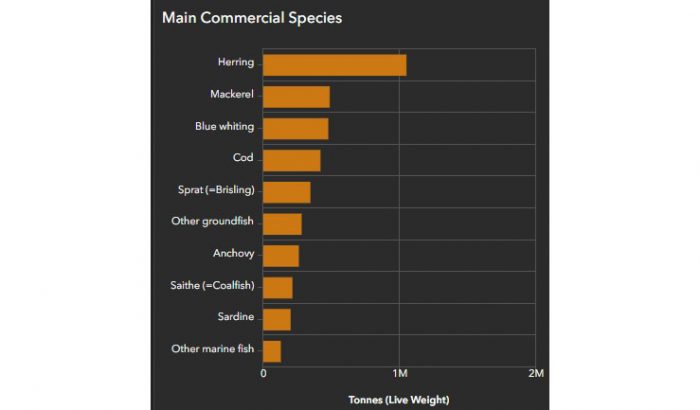
The first key element was a bar chart displaying the main commercial species. This chart was configured to be fully interactive: when a user selects a sea area on the map, the chart dynamically updates to show data specific to that location. This creates a clear and intuitive link between spatial and statistical views.
To enhance readability:
- Bars were sorted in descending order to highlight the most significant values
- Colours were matched to the map selection, reinforcing visual connections
- Interaction behaviour was kept consistent across elements
The same design principles were applied to additional components:
- A second chart showing Commodity Group statistics
- A pie chart displaying country-level statistics, with smaller values grouped into “Other”
- Indicators showing totals, percentages and year values
- A list of selected Sub-Areas
By maintaining consistent styling and interaction patterns, the dashboard delivers a cohesive user experience, allowing users to explore and compare different aspects of the data without confusion.
5. Adding the Source and Publishing the Dashboard
Proper attribution is a critical final step. The dashboard includes a reference to EMODnet along with the appropriate Creative Commons licence, ensuring transparency and compliance with data usage requirements.
Once complete, the dashboard was published and made publicly accessible.
You can explore the final result here: [View the interactive dashboard]
Design Considerations
Throughout the process, several key design principles guided the work:
- Choosing the most appropriate visual elements for the data
- Prioritising clarity by ordering values and grouping minor categories
- Reinforcing interactions between map and charts
- Using colour consistently to connect visual components
- Referencing metadata to ensure accurate data representation
Summary
This workflow demonstrates how complex spatial data can be transformed into an intuitive, interactive dashboard through careful planning and design. By focusing on data quality, performance optimisation, and user experience, it is possible to turn raw datasets into meaningful visual insights.
Comments are closed here.