A map projection is an attempt to portray the surface of the earth onto a flat surface. It is impossible to do this without some distortions of conformality, distance, direction and/or scale. The most famous map projection is without doubt the Mercator projection. Mention Mercator to a cartographer and you are likely to be at the receiving end of a rant about distortion and land mass, yet Mercator is the map projection of choice for web-based mapping services such as Google Maps. This article looks into why the Mercator projection is both popular and controversial.
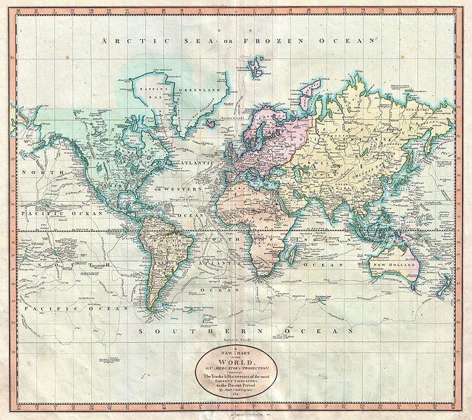
Map of the World using the Mercator Projection
The Mercator projection was presented by the Flemish cartographer Gerardus Mercator in 1569. The projection conserves angles with the meridians. This means that if a navigational path is defined as a constant bearing measured relative to north, the path will be represented as a straight line across the map. Because of this useful property, it became the standard map projection for nautical navigation.
Unfortunately, as with all map projections, there is a compromise – it vastly distorts the size of objects as the latitude increases from the Equator towards the poles. This can be seen when studying the size of Greenland or Alaska on a world map based on the Mercator projection. Because of its latitude, the relative size of these land masses are greatly exaggerated. When using the Mercator projection for nautical navigation, this distortion is accepted as this drawback is greatly outweighed by the projection’s positive properties.
The Mercator projection became very familiar through the centuries. Because of its familiarity, it was used throughout the 20th century for many other purposes other than navigation, particularly in the media. And it is here where the real problem lies.
What is the issue with the Mercator Projection?
There is a general trend that GDP per capita increases with distance from the equator. The reasons for this are complex and widely debated, but include factors such as differences in climate and soil quality. Therefore the Mercator projection has the broad effect of making countries with a higher GDP per capita (such as USA, Canada, UK, Italy, Australia and Japan) look larger than they really are when compared to countries with a lower GDP per capita (such as Ethiopia, Sudan, India, Yemen and Nicaragua). Of course there are exceptions to this, but with this general trend the Mercator projection becomes politically sensitive as it can wrongly shape people’s perception of the world.
With globalisation and the introduction of computers, the use of the Mercator projection decreased. Cartographers could easily manipulate maps and geographical data and experiment with other more suitable map projections. The ‘Robinson’ projection for example, offers a compromise between conformality, distance, direction and scale distortion. Another alternative, the ‘Mollweide’ projection, is an equal area projection and is suitable for depicting global distributions. Today, you’re unlikely to find an atlas page making use of the Mercator projection.
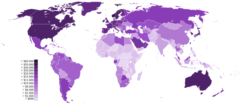
GDP (PPP) per capita by countries
That’s far from the end of the story though. In 2005, something called ‘Google Maps’ was launched. And what map projection did it use? Mercator! Other mapping services also use the controversial map projection: Bing Maps, Nokia’s ‘Here’ maps and OpenStreetMap.
Why is the Mercator Projection still used?
At first, this choice seems to fly in the face of cartographic expertise. Why choose such an unpopular map projection? The reason lies in its delivery method and intended use. People generally use such services to find nearby locations and find the fastest route to them. When using the Mercator projection you will always get a local street level map that is virtually free from distortion and rotation. It’s only when zooming out beyond a regional level when the area distortion becomes apparent. The scale bar can also dynamically change depending on your latitude, something that a paper map can not do. Taking these things into account Mercator becomes the natural choice, even only choice, of map projection for this purpose.
The problems of area distortion can still be all too apparent though. When zooming out beyond our region of interest, then the same distortions and effects on our perception apply. There is now a trend to use such interactive mapping services for presenting thematic maps of the world, showing colourful, interactive maps visualising news-worthy statistics. Using the Mercator projection for representing and comparing global data and trends reverts us to its original disadvantages.
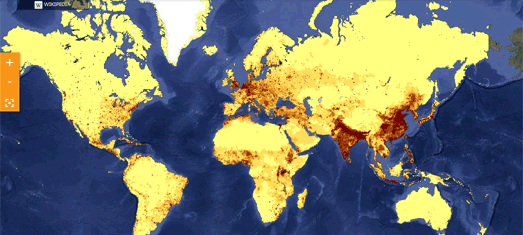
Interactive Thematic World Map using the Mercator Projection
Recently we were approached by a customer wanting a new map projection for their corporate world map as “Africa looked too big” on its current map (based on a Robinson projection). Possible proof that the Mercator projection still wrongly shapes our overall perception of the size of countries and continents. There will never be a perfect solution for representing the map of a globe on a flat surface – it is mathematically impossible. That’s why it is important that experts in geographic data recommend (and even convince) customers of an appropriate map projection taking into account the geographic coverage and purpose of a map, be it on paper or digital.
Comments are closed here.