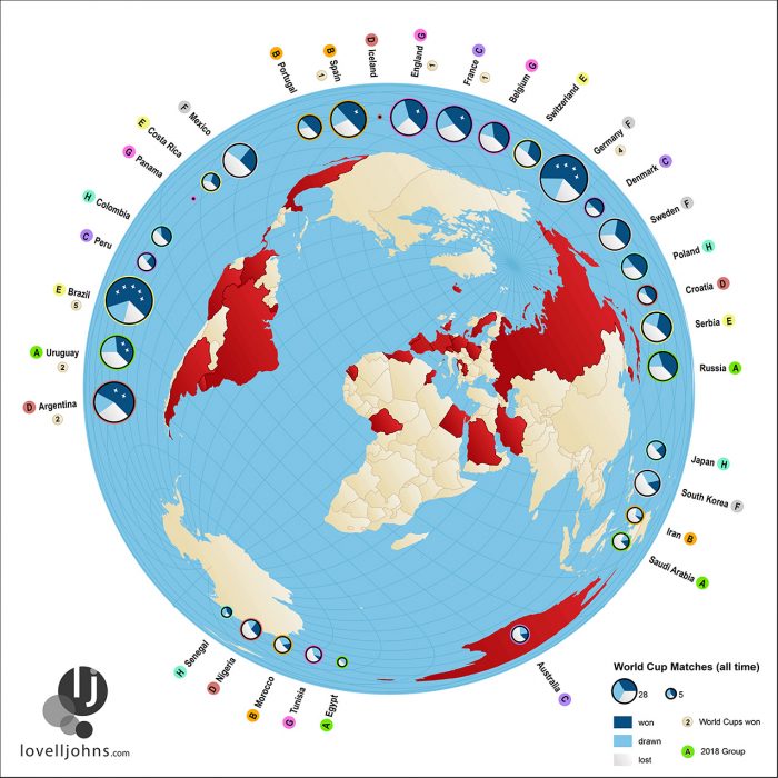
With the World Cup kicking off today, our custom map projection can help you understand which of the 32 teams you should be rooting for.

How to read it
Our World Cup Football Map highlights the 32 competing countries in bold red. In fact, we’ve adapted the brand colours for the World Cup logo quite accurately across the map, a service we’re quite proud of and regularly provide our clients. The map uses a custom projection with a very suitable football shape, so at first glance it might seem a little confusing compared to maps you’re used to. We’ve spoken about types of map projections before, if you’d like to brush up on them. The map is oriented so that the superpowers of World Cup football and venues are lined up across the centre of the map.
So, on the left we have the giants of South America and all the winners in Western Europe on the right including of course, the hosts Russia. New Zealand may not be in the World Cup but unlike other maps, they’ll be pleased that we’ve included them (under Antarctica). They may well notice that their neighbours Australia are a competing country that is quite heavily distorted, to the point where people might not recognise it!
How we use data on the map
No digital mapping exercise for a World Cup is complete without taking into account win percentages. Orbiting around the edge of the map, mostly above the vast Pacific Ocean, you can see pie charts showing the overall Win-Draw-Loss record of each country in previous World Cup (finals) tournaments. The size of the circle displays how many games the country has played. Brazil and Germany top the lists of tournament appearances and win percentages, and unsurprisingly have played over 25 more games than the next country, Argentina. Iceland and Panama are making their debuts.
The dark blue coloured pie-chart sectors show Win Rates. English supporters may naturally notice the relatively large light-blue draw sector for England, and the lack of a previous win by Egypt as well, the country of 2018 PFA player of the year, Mohamed Salah. We’ve also got previous World Cup wins on the map as we felt it better not to forget those countries that didn’t make it, including Italy with 4 previous World Cups.
So which Group is the easiest?
We took care to include brighter colours to show the 8 groups at the World Cup. So which groups would you say look the trickiest based purely on tournament history? Group E comfortably have the highest average win percentage, helped by Brazil who might not have an easy start to the tournament. Group F on the other hand boast the most World Cup games played, and also have the highest average FIFA ranking.
The bookies might point to Groups D and H which have the lowest combined betting odds. And for the most excitement, the Group C teams top the historic goals-per-game chart.
So fans should find plenty of entertainment from the start, even if the World Cup wins record points to the same few countries bringing home the trophy. With digital mapping however, you can see that this particular World Cup is a lot closer than some bookies might have you believe.
Comments are closed here.